
Drawing Basic Plots in MATLAB
Visualization is a crucial part of MATLAB’s functionality. MATLAB provides a wide range of functions to create various types of plots for visualizing data effectively. This section covers the basics of drawing plots, along with several examples and explanations.
Creating Basic Plots
The plot function is commonly used for creating 2D line plots:
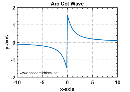
% Plotting an arc cot wave (inverse of the cotangent)

x = -10:0.1:10;

y = acot(x);

plot(x, y);

title('Arc Cot Wave');

xlabel('x-axis');

ylabel('y-axis');

grid on;
Output:
A smooth inverse Cot wave with x-axis labeled as 'x-axis' and y-axis labeled as 'y-axis'.
Adding Multiple Plots
You can plot multiple lines on the same axes by calling the plot function multiple times or passing multiple data sets:
% Plotting multiple lines

x = 0:0.1:10;

y1 = sin(x);

y2 = cos(x);

plot(x, y1, 'r', x, y2, 'b');

legend('Sine', 'Cosine');

title('Sine and Cosine Waves');

xlabel('x-axis');

ylabel('y-axis');

grid on;

Scatter Plots
Scatter plots are useful for displaying individual data points:
% Creating a scatter plot

x = rand(1, 50);

y = rand(1, 50);

scatter(x, y, 'filled');

title('Scatter Plot Example');

xlabel('x-axis');

ylabel('y-axis');

grid on;

Bar Plots
Bar plots are useful for comparing data across categories:
% Creating a bar plot

categories = {'A', 'B', 'C', 'D'};

values = [3, 7, 5, 9];

bar(values);

set(gca, 'xticklabel', categories);

title('Bar Plot Example');

xlabel('Categories');

ylabel('Values');

grid on;

Histogram
Histograms are used to display the distribution of data:
% Creating a histogram

data = randn(1, 1000);

histogram(data, 20);

title('Histogram Example');

xlabel('Bins');

ylabel('Frequency');

grid on;

Creating a Chart with Two Y-Axes
The yyaxis function in MATLAB allows you to create plots with two different y-axes, each having its own scale. This is particularly useful when visualizing data with different units or ranges on the same figure.
% Creating a plot with two y-axes

x = 0:0.1:10;

y1 = sin(x);

y2 = 10 * cos(x);


% Plotting on the left y-axis

yyaxis left;

plot(x, y1, 'b-', 'LineWidth', 1.5);

ylabel('Sine Values');


% Plotting on the right y-axis

yyaxis right;

plot(x, y2, 'r--', 'LineWidth', 1.5);

ylabel('Cosine Values x 10');


% Adding title, labels, legend, and grid

title('Chart with Two Y-Axes');

xlabel('X Values');

legend({'Sine', 'Cosine x 10'}, 'Location', 'Best');

grid on;
Output:
A figure with two y-axes.
- The left y-axis represents 'Sine Values' and displays a sine wave.
- The right y-axis represents 'Cosine Values x 10' and displays a cosine wave scaled by 10.
- Both plots share the same x-axis, labeled 'X Values'.

3D Plots
MATLAB supports 3D plotting using functions like plot3, mesh, and surf:
% Creating a 3D surface plot

[x, y] = meshgrid(-2:0.1:2, -2:0.1:2);

z = x.^2 - y.^2;

surf(x, y, z);

title('3D Surface Plot');

xlabel('x-axis');

ylabel('y-axis');

zlabel('z-axis');

grid on;

Useful MATLAB Functions for Plots
Practice Questions
Test Yourself
1. Plot a sine wave and a cosine wave on the same figure with proper labels and legends.
2. Create a scatter plot for 100 random data points.
3. Generate a bar plot for the monthly sales data of a store.
4. Create a 3D surface plot for the function z = sin(x) * cos(y).